
User Research
Explored where symptom tracking for pregnancy fell short today, and looked at how competing apps handled it.
Responsive mobile app design for Trellis Health
The goal
Women go through a lot of changes during pregnancy — from normal headaches to fluctuations in mood to severe health conditions. Women have predominantly used symptom trackers for their menstruation cycles and pregnancies, but when it comes to tracking symptoms specifically for pregnancy, there’s a need to create a reliable way to not only log them, but also review the data collected to track one’s health. This might help avoid any unforeseen issues during and after the pregnancy.
My role and ownership
We followed the following design process, and it was iterative in nature.
Explored where symptom tracking for pregnancy fell short today, and looked at how competing apps handled it.
Defined the requirements and mapped out user scenarios and flows for logging and reviewing symptoms.
Sketched early ideas, built a mood board for the visual direction, and moved into high-fidelity prototyping.
Ran A/B tests on two design directions and tested usability with real users.
Research
Domain of inquiry
For pregnant women, symptoms range at different levels. There are common symptoms, and some that occur at certain times. Some symptoms might be associated with each other, while others might occur together for various reasons. We targeted symptoms that are common, associated, and that need monitoring — symptoms that might be severe and lead to serious health conditions or complications in pregnancy.
Competitor analysis
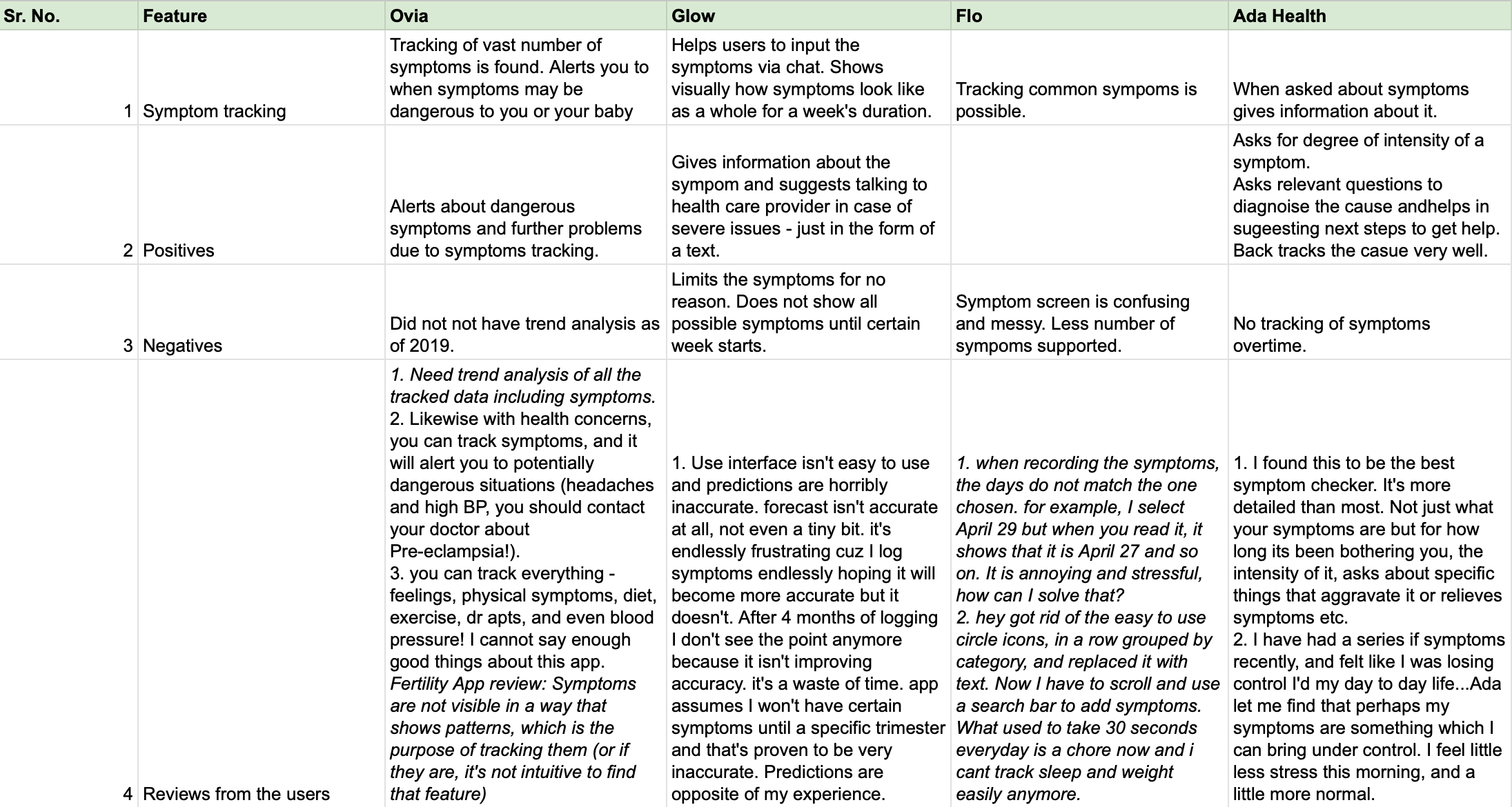
Competitor analysis was performed to learn about the symptoms feature available in the market, for both menstruation-cycle tracking and pregnancy-tracking apps. We studied popular apps and the symptoms feature in each one, and made a note of the factors that helped them stand out, or the factors that worked well for people to use the app over a longer duration.
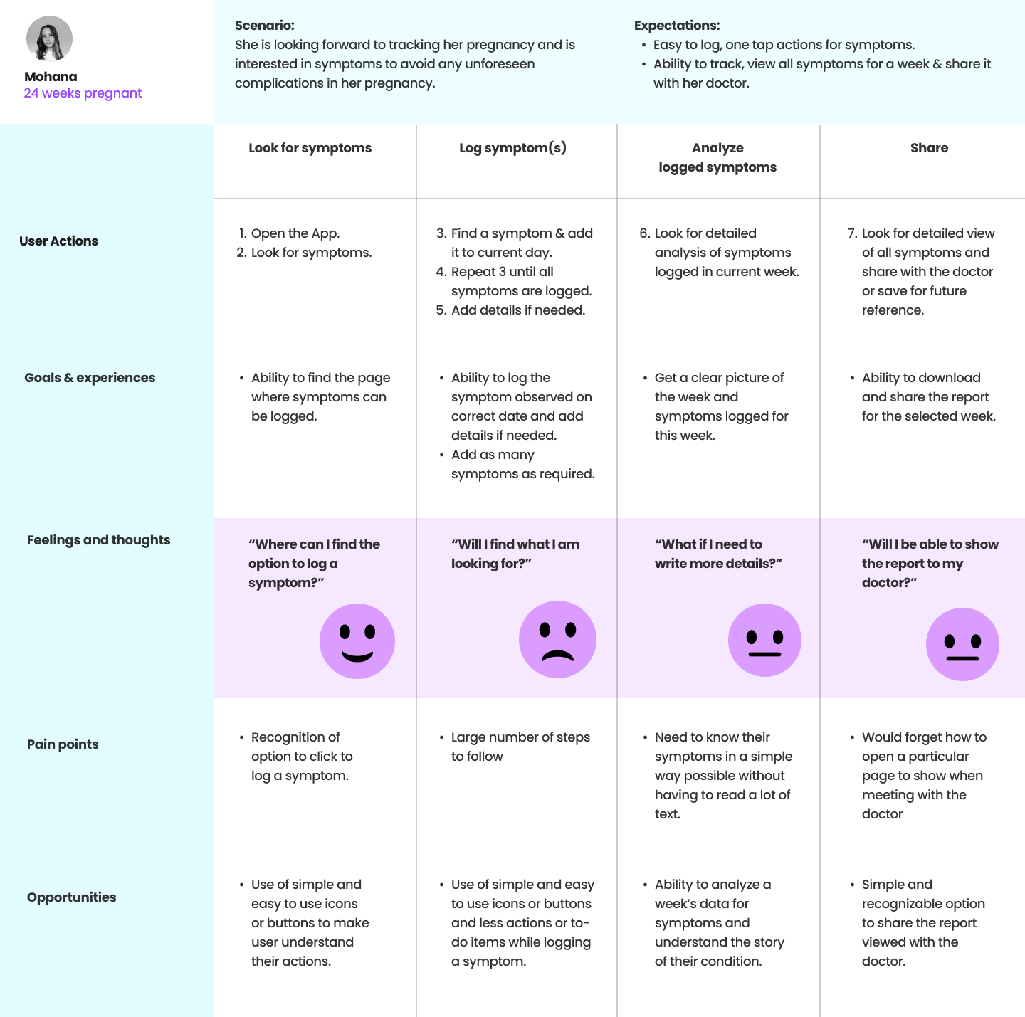
User journey map
Common observations about symptoms:
Key insights
Process
Sprint 1: Conceptual Design
User stories were created to define the scope of the feature’s functionality. The following requirements were finalized after multiple discussions and brainstorming sessions:
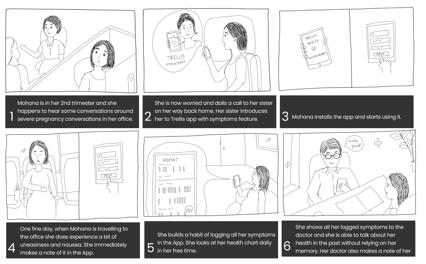
Sprint 2: Interaction Design
Inspired by the ideas, I started creating sketches, finalized the lo-fi sketches with the team, and then started working on hi-fi design screens in Figma.
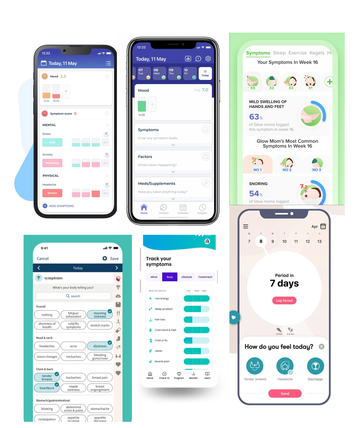
After iterating on the design for logging symptoms, I tried creating simple views that would accommodate overlapping symptoms and rule out the cons of the earlier design.
Logging symptoms with the list-view design:
Adding details for a logged symptom, and exploring all logged symptoms:
Evaluation
With the two designs created, I planned a usability test. The purpose was to find out how women would use the symptoms feature, and to test between the chips view and list view.
I recruited participants who were pregnant or planning to get pregnant. We interviewed all 4 participants in 2 days — a 30-minute test session with 3 tasks, held online over Zoom.
Major findings
Impact
Learnings