
Discovery
[Weeks 1 to 2]Onboarded with the insurance client and analyzed the reporting landscape along with the organization stucture of relevant user base.
Transforming Insurance Intelligence with the power of AI
Due to NDA, some content and specifics have been redacted.
Scroll to read the case study
The goal
My client, a leading insurer, set out to revamp 100+ fragmented legacy dashboards and disconnected data sources that were slowing operations and decision-making.
Across 7 diverse business user groups, inconsistent KPIs and manual calculations created data latency and made it difficult to turn reporting into actionable insights. Meanwhile, short-term dashboard fixes had created a fragmented ecosystem that was difficult to scale.
My goal was to uncover the root causes behind this reporting chaos and create a scalable intelligence layer connecting validated data and meaningful KPIs to the needs of executives, managers, and analysts.
Business users needed a reliable way to find and understand the right KPIs without manual calculations or digging through fragmented reports, so they could make timely, confident decisions.
The business needed to replace fragmented, short-term reporting solutions with a scalable and unified dashboard ecosystem that could support faster decision-making, operational efficiency, and future growth.
My role and ownership
Onboarded with the insurance client and analyzed the reporting landscape along with the organization stucture of relevant user base.
Co-led 30 (40-min) user interviews/observations, 7 focus groups (84 participants - 60-min) and understood the data. Ran 60-min card sorting activities for top 100 KPIs with all 3 user bases.
Synthesized the findings and focused on points of friction and user goals. Created mental models. Registered user flows with buiness goals and user actions. Brainstormed with claims industry experts for AI based recommendations and overall reporting system feedback.
Designed lo-fi dashboard wireframes for quick testing with the users. Evaluated intial design screens with 30 users (30-min). Created an inclusive data visualization design system from scratch in Figma. Rendered hi-fi design screens. Prompt engineered executive summaries for crucial dashboards.
Presented research and design pieces to the buisness stakeholders. Handedover the technical specification and functional specification of the dashboards.
Research
The interviewes were all about gathering the pain points around report usage behavior.
The research plan evolved as I realized that users could describe the data they used, but not always the KPI they needed. I shifted the conversation toward their day-to-day business goals, decisions, and workarounds to uncover the underlying requirements.
I anlayzed 10K+ data columns to understand the kind of information is being populated on the existing dashboards; how are the daat points related and calculated. More than 1K attributes were anlyzed and mapped to the user flows as per the personas.

I conducted 7 focus group sessions across three rounds. It was about understanding KPIs used by each user group (executives, managers and analysts in each organizational group or insurance life-cycle); what they use today vs what KPIs they need and why. It helped in validating and prioritized the redesigned KPIs by criticality of buisness needs.
Key insights
The problem wasn’t simply that the dashboards lacked the right metrics. Contextual inquiry revealed a deeper gap: business users understood their goals and decisions, but struggled to articulate the specific KPI needed to represent them. As a result, they often downloaded report data and performed their own calculations to arrive at the answer.
“I was not sure how to ask for this metric I calculate because it involves many permutations and combinations to say it is the right one.”
Senior Claims Executive, reviewing the claims executive dashboard
The reporting problem extended beyond the dashboards themselves. Users were pulling information from three different sources, dealing with data that wasn’t always current, and ultimately using a physical calculator to validate the savings value they needed. This revealed a deeper trust and data-fragmentation problem: the system didn’t provide a single, reliable source of truth for critical business decisions.
“I always find the savings value on my calculator!”
Senior Claims Manager, reviewing the claims executive dashboard
The challenge
How might we unify goals, data, and KPIs so that claims users can make decisions without piecing information together?
Process
Sprint 1
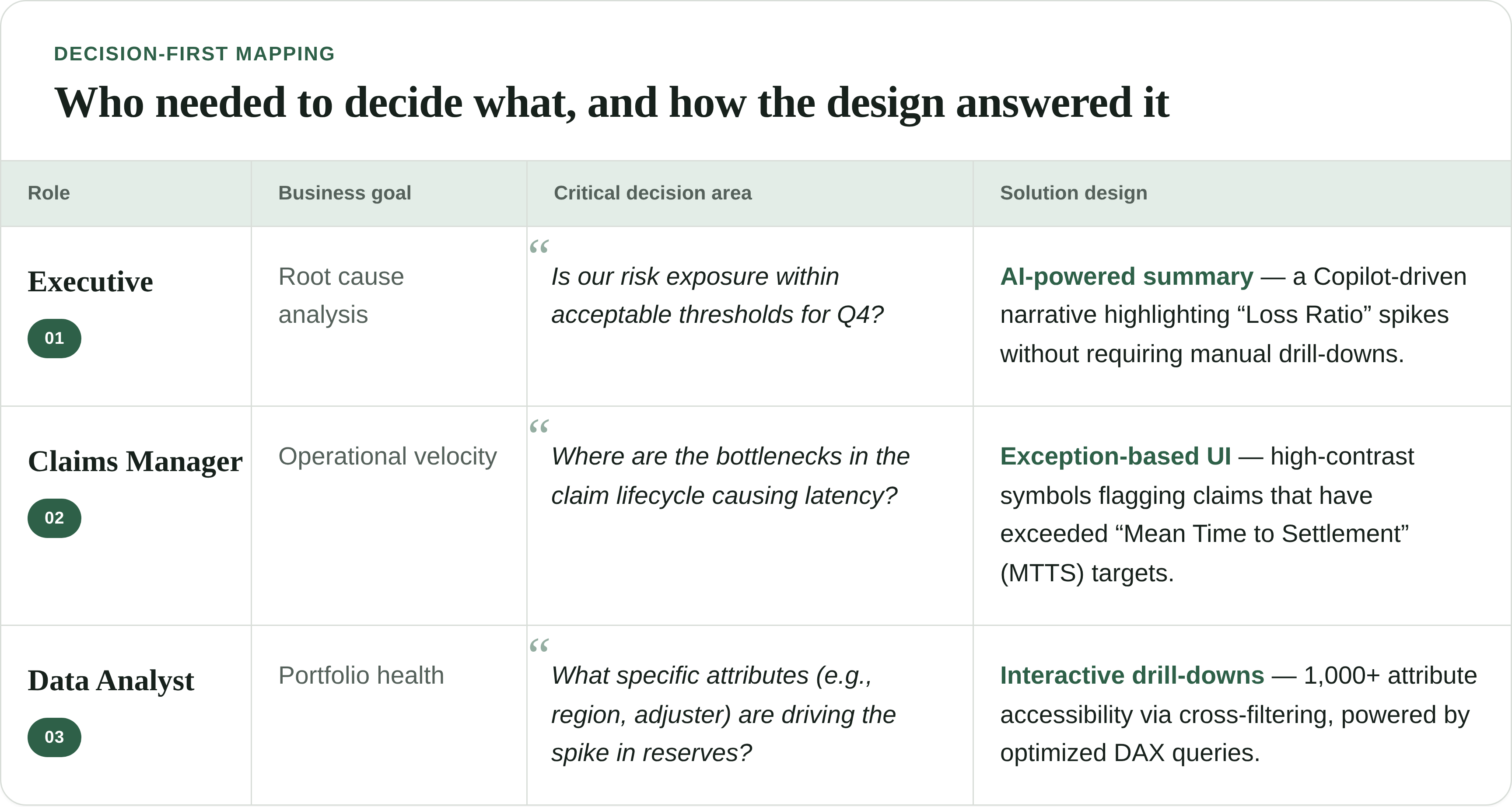
I created a decision mapping as soon as I found out the roles and their hierarchies in the organization and their critical business goals. I added potential solution decisions to ensure we are setting the right expectations from the beginning.
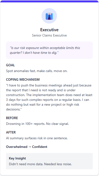
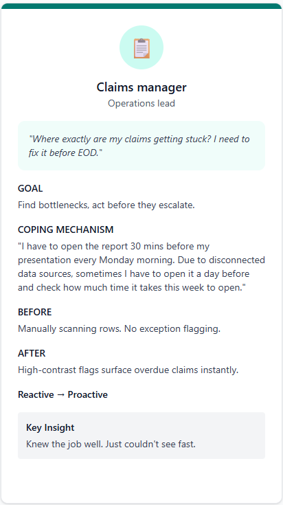
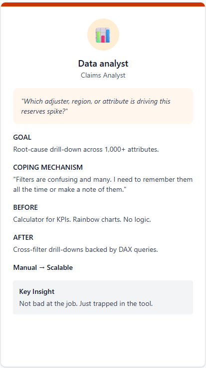
I created archetypes to map each user group's mental model. This helped us get to the core of the problem, stand in the users' shoes, and understand what they said and why. Ultimately, this made it much easier to identify and jot down the key pain points and requirements.
Sprint 2
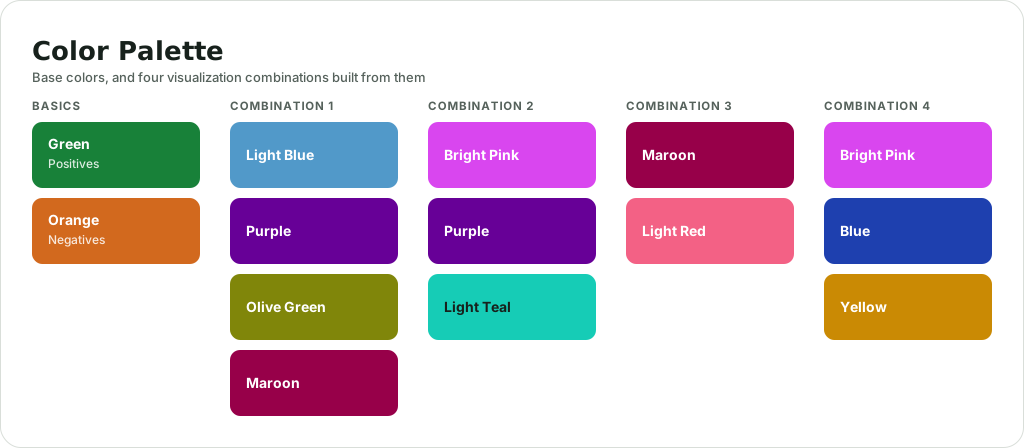
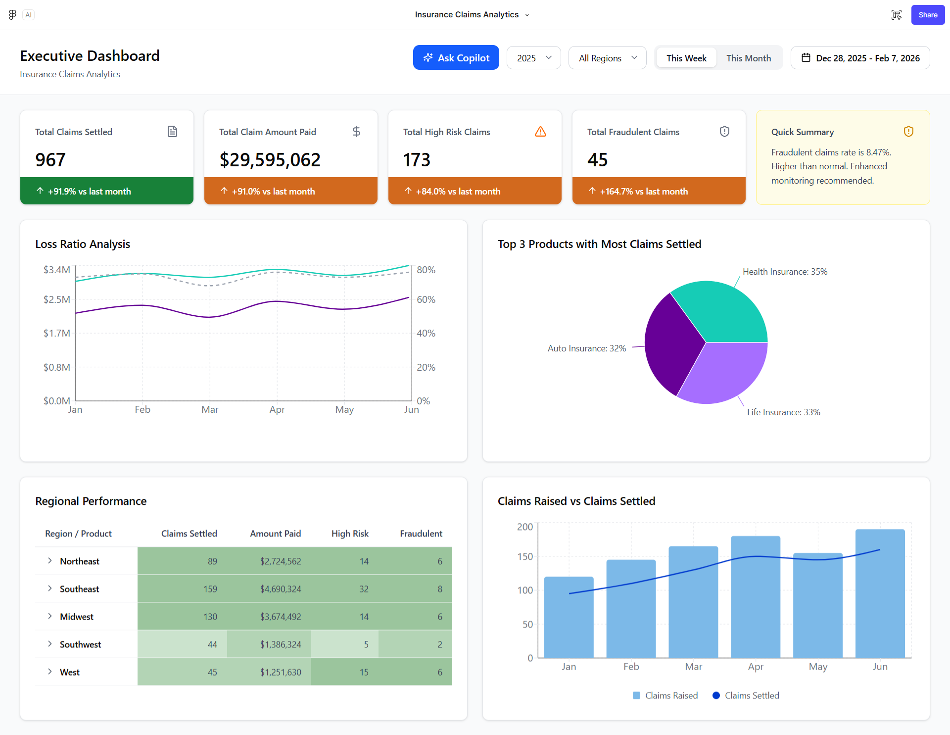
I created an accessible design system featuring a strategic color palette, high contrast, and prominent status indicators for risk. It was designed to guide users through the necessary information to achieve their goals. Accessibility was critical, as the existing system lacked readability, consistency, and sufficient contrast. As a result, colorblind users could easily distinguish status indicators and intuitively navigate data through simplified visualizations.
The pivot
The data roadmap was solving yesterday's problems
Midway through the engagement, I discovered that the Data Engineering team was building new Data Marts by lifting and shifting legacy attributes, while our research had uncovered new KPIs that users actually needed to make decisions. The existing roadmap could reproduce the old reporting system, but it couldn't support critical metrics like Savings Value and Claims Velocity.
I used the KPI Validation Sheet to map business criticality against technical effort, bringing Business and Technology leads together to identify the data gaps and prioritize the KPIs that mattered most.
The new direction
Impact